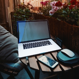
 Most all busy entrepreneurs today have a website and if they don’t they are thinking of having one designed. We suggest to our clients that all websites need to be re-designed at least every two to three years.
Today’s brands demand that all websites are responsive and mobile-friendly. They must be functional on computers, tablets and all mobile devices. Additionally, the newer sites are visually beautiful and stay current with new bells and whistles available online.
Designing today’s WordPress websites requires more knowledge than what is known as a simple “drag and drop” application which is advertised widely. For a functional and beautiful WordPress site the developer needs a basic understanding of php programming, CSS (cascading style sheeting) methods, html code and java script experience.
WordPress has become the “go to” process for many new entrepreneurs just starting out. It is also the choice for those business owners who want more flexibility and more independence.
 Websites now appear on everything from computers to small cell phone screens and tablets. Developers are no longer designing using the traditional “grid.” The designers of today are not limited to building designs on a grid pattern layout. Instead they use asymmetrical technology for more eye-catching re-designs. These design-centric projects are created to stand out in the crowd. This method along with the parallax scrolling effect brings new depth and a more appealing looking website. Content is still king and all text should be researched to deliver the best marketing strategy.
 Typography and vibrant color schemes:
The going thing today for typography is bold and big lettering for website design. Since many custom fonts are now freely available online, and there is plenty of whitespace, adding a new easy to read font will enhance the site’s overall appeal. it is also a good idea to spruce up the site with great color schemes. Since monitors have improved and are able to show colors clearly, there is no need any longer to stick to “color safe” colors as in the past. Gradients too, are making a comeback such as gradient filters appearing over photos.
Pop-Up Notifications:
This is a push button which prompts the user to click and take an action such as downloading a coupon, encourages the user to participate in a live chat or to take a survey as a few examples. Most of our clients feel this effect can be annoying and they should be used very rarely, if at all. However, some feel it has increased their conversion rate and it has good browser support and is accepted on most mobile devices. The pros and cons should be considered before adding these push notifications to the new re-design.
This year you will be noticing that more animation will show up on some website backgrounds. Get ready to start seeing more generic visuals which are customized by the designers. These one-of-a-kind graphics and unique illustrations follow today’s trends for a more visual and dramatic web experience. Video backgrounds are very popular today and they tell a story visually to capture the visitor’s interest. A particle background is a new way for showing movement in the background of the website pages, without using video files. There are tutorials available and plugins online for those designers who want to include this method in the re-design. In many cases a particle background is used in place of a video for two important reasons:
- The file size is smaller
- You don’t rely on third-party video players
Animation (the future of design work):
Animation will be the wave of the future. Using animation will allow developers to start using static visuals and to embrace real movement for re-design work. They are a breath of spring to overcome the older more formal rigid pages. It all works to create a more interactive user experience. Having a more visual appeal will improve the conversion rate for site owners and build a following for their brand. A “win win” for both the designer and the website owner.
Animation, logos and other navigation methods:
 Using animation will help logos appear more memorable. The moving logo presented in a more dramatic fashion which will help them to become more recognizable. Many programmers are using animation during load to let the viewer know that the website is loading. This method keeps the visitor from becoming bored and leaving the website. With the coming of mobile-friendly WordPress platforms, designers are choosing to add other types of menus rather than the older classic navigation styles. Hidden menus, slide-ins and other animated choices are now being introduced in WordPress re-designs. Methods such as a mouse-over effect and a scroll triggered effect is a couple of choices used today for updated menu applications.
Visuals and mobile-friendly methods:
Online content is made more interesting when combined with visuals which tell the story. Great visual engage the viewer and convey a message that text alone will not. Stock photos or images owed by the client which are in raw form are best.
When adding a picture from a stock photo site you should research to find out how many other sites are using that image. Try to add images that are new and refreshing. Having a professional photographer is by far the best choice to give your site a unique look and feel.
Thanks for stopping by to visit. Keep in touch as you think of re-designing your site. Contact us to see our spring and summer design specials.
Staff Writer
Inside Design Orlando